

Hi there. I know this is quite late, since it should have been posted Friday. Thanks for waiting on me! I’ve been finishing up some new patterns that should be out really soon.
This week we’re going to talk about fabric.
I certainly recommend quilting-weight cottons when you are quilting. Avoid fabrics like polyester and knit, especially for your first quilts. Also heavier weight cottons would not be suitable. Quilting weight cottons come in a variety of colors and prints. The ones sold in quilt stores are by far the best. Discount store cottons tend to be a looser weave with lower thread count, prone to raveling and fading. My opinion is, if you’re going to spend all the time it takes to make a quilt, then spend the extra dollars for better fabric.
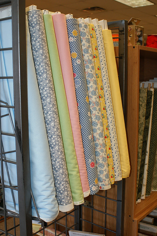
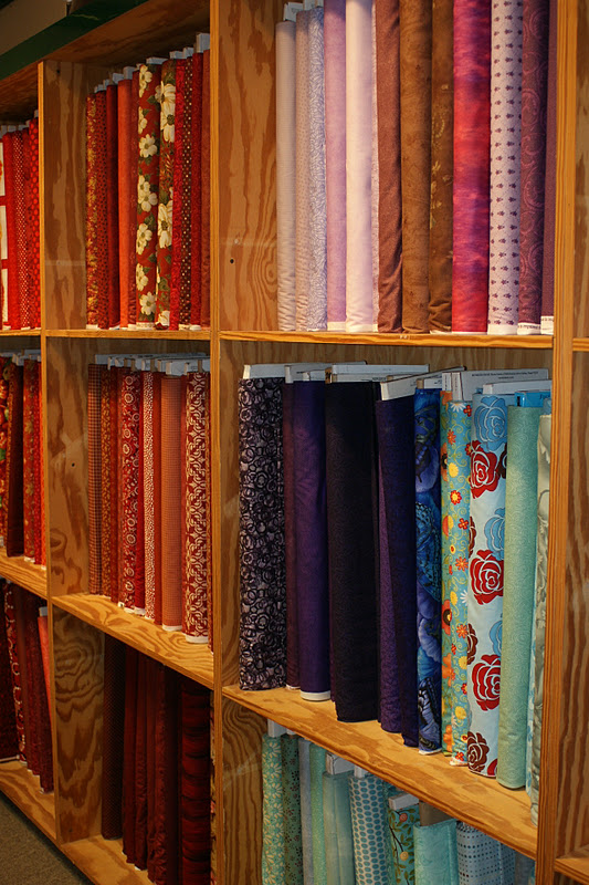
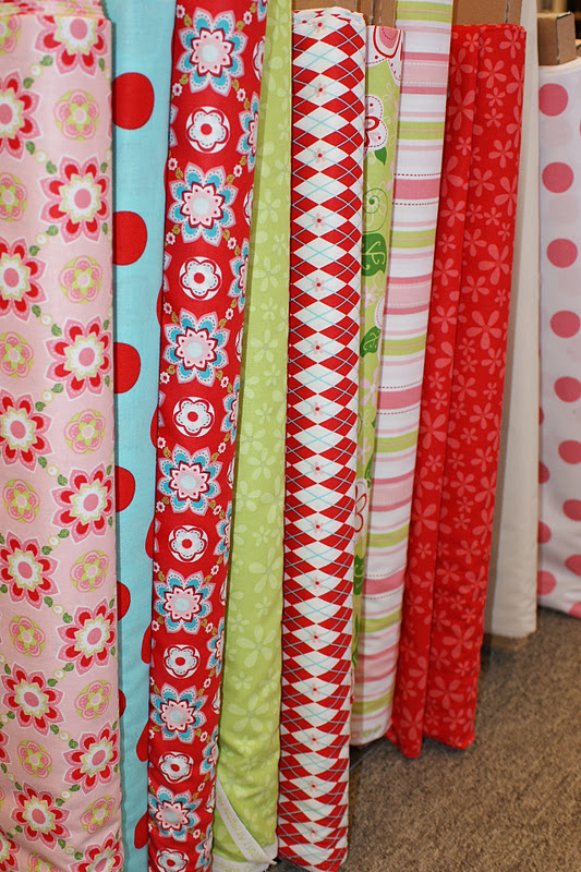
Now let’s move on to color choices. Quilt stores generally group fabric in one of two ways: by color like the top photo or by collection like these bottom two. Shopping by collection is pretty much a foolproof way of combining fabrics. After all, a designer made them to go together. The above photo contains thirties prints which is another nice way to choose fabric: by era. Generally speaking, using fabrics made to look like a certain time period will match each other. If this is all too matchy-matchy for you, let’s look at another way to choose fabric.
Here’s a little lesson in art, just like I teach my students each year. As you can see, there are primary, seconday and tertiary colors. A great way to choose colors is to choose complementary colors, those that are directly across from each other on the color wheel. These colors will always appear more vibrant when they are used together, such as yellow and purple. Or you can use two complementary color groups in a quilt, such as purple and yellow, red and green.
Too wild for you? How about a split complement? Again, if you choose yellow, the split complement would be red-violet and blue-violet. This would be a little less vibrant than a direct complent and you also get an extra color. Adding white or black can ground these colors.
Of course primary colors or secondary colors can also be used as a color scheme. These are called triads and can be any three colors equally spaced on the wheel.
For the least amount of contrast, choose an analagous color scheme, or those colors next to each other on the wheel, such as red, red-violet and violet.
Adding white to the color is called a tint (red to pink), gray is called a tone and black a shade. All of these variations create a myriad of different colors. And even though I am scrappy, scrappy, scrappy, I always keep the color wheel in mind. I often play complementary scraps off of each other in a small part of the quilt.
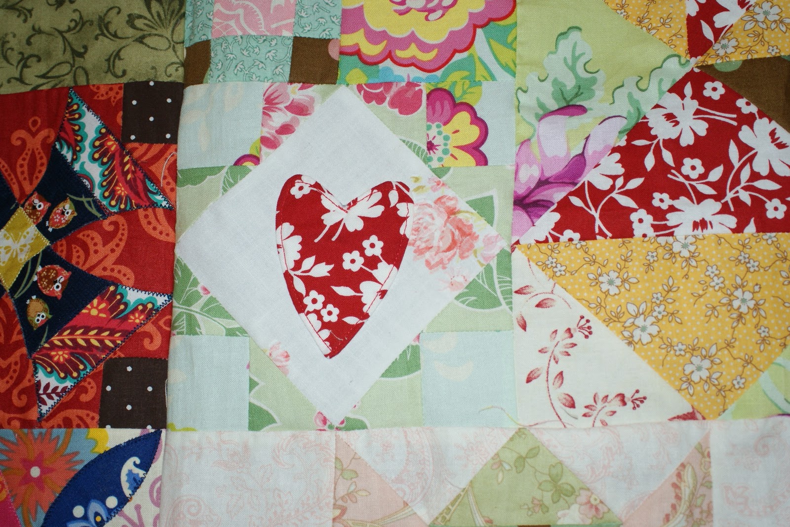
The most important thing to keep in mind is to play with it. If you love fabric, you know that you can spend hours sorting through it and making combinations. Just give yourself permission to play.
Finally, before you start your quilt, decide whether or not you want to prewash your fabric. I seldom do unless it’s red. Red fabric tends to bleed. I love the look of a washed quilt and the effect washing has on a quilt after it has been quilted.
Next up, choosing a pattern.
Love,
